Logo Design
Overview:
• In 2024, I was entrusted with designing a series of diversity logos for Entertainment Partners, to be used globally.
Project Scope:
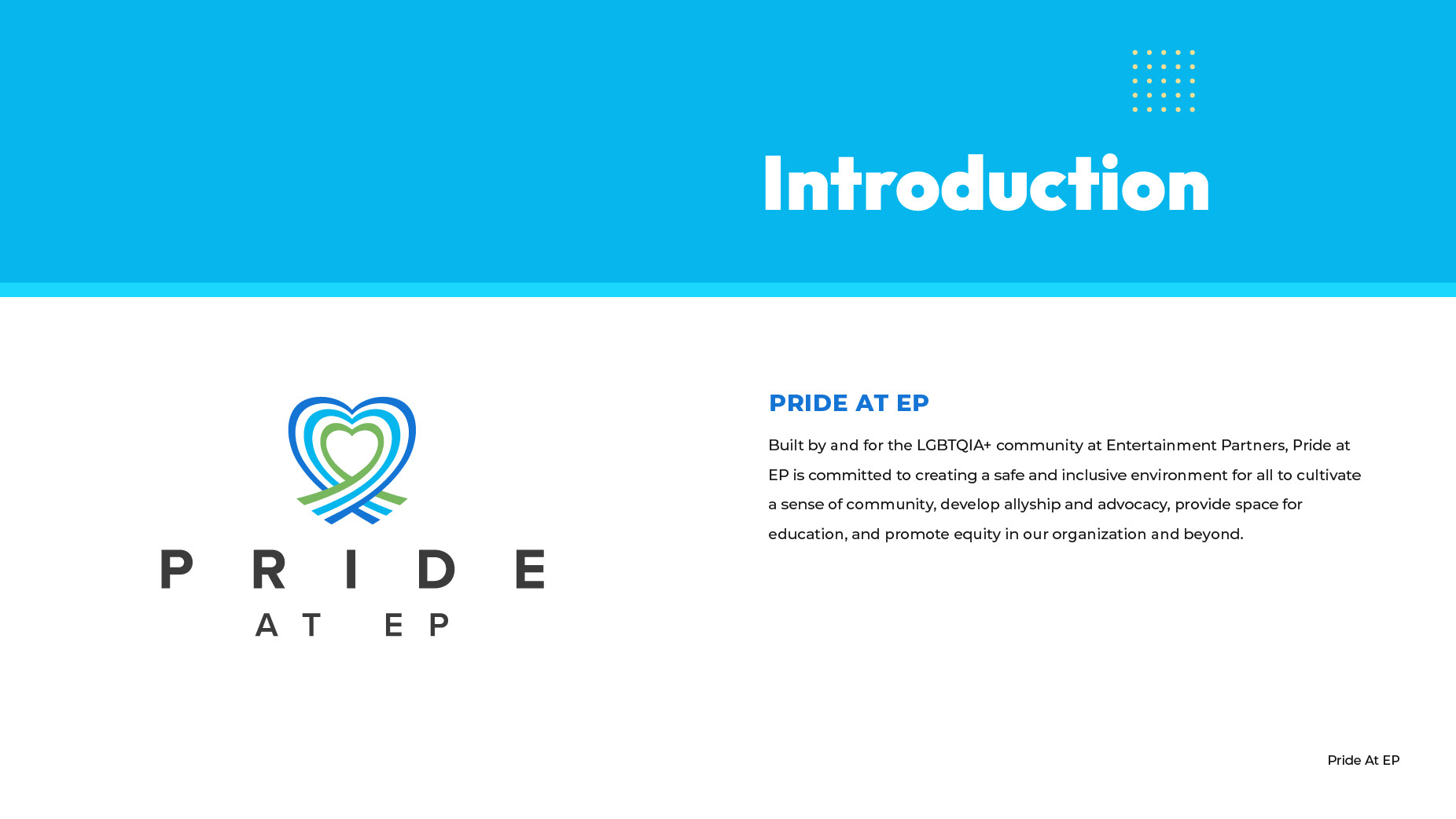
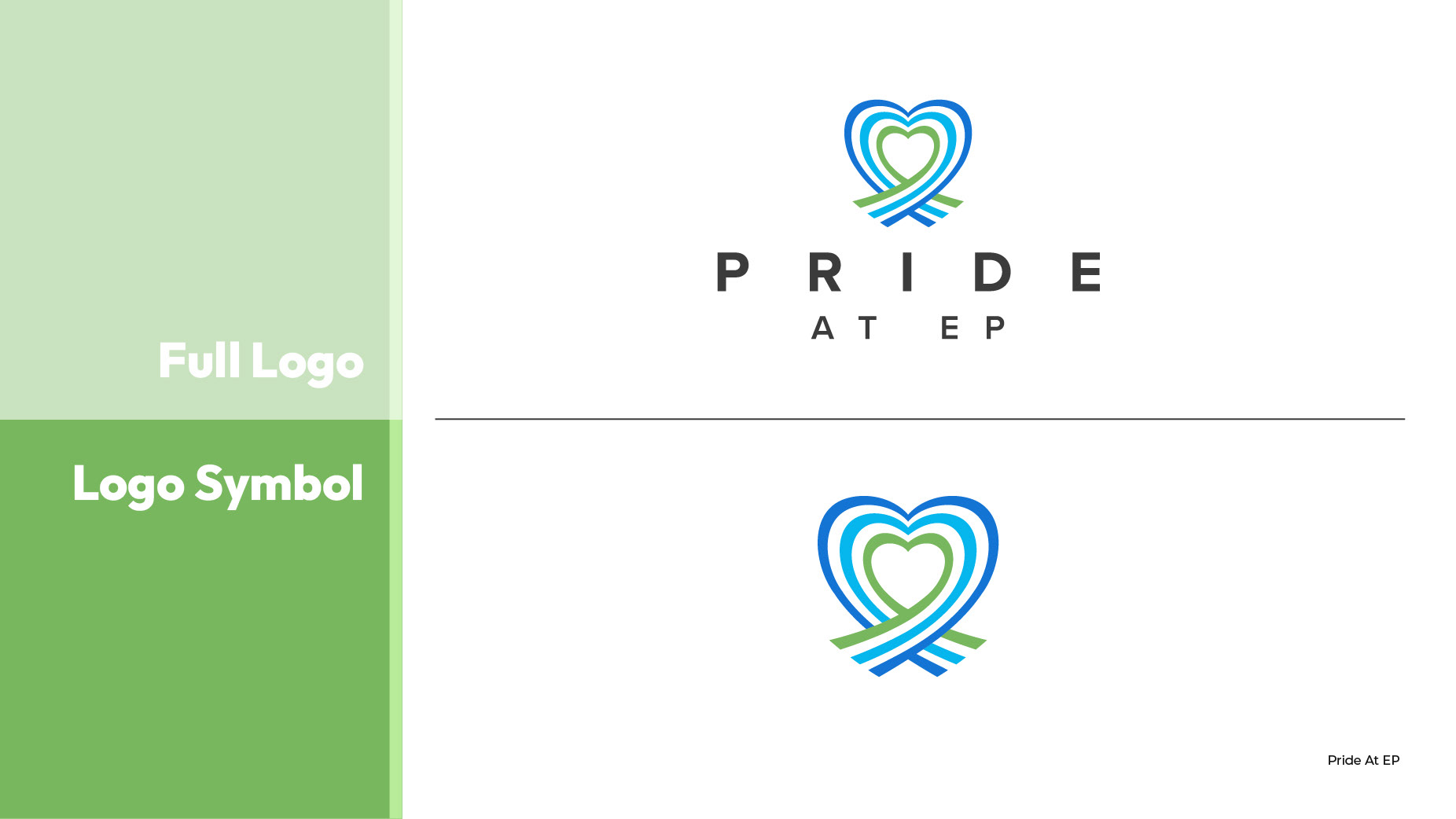
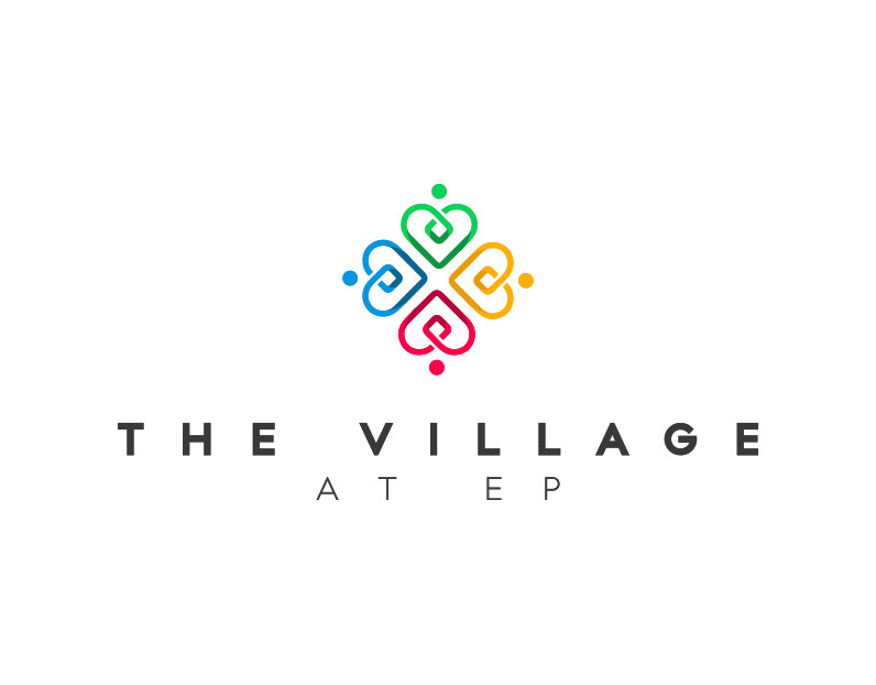
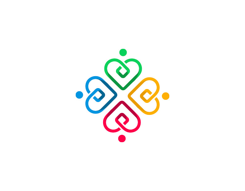
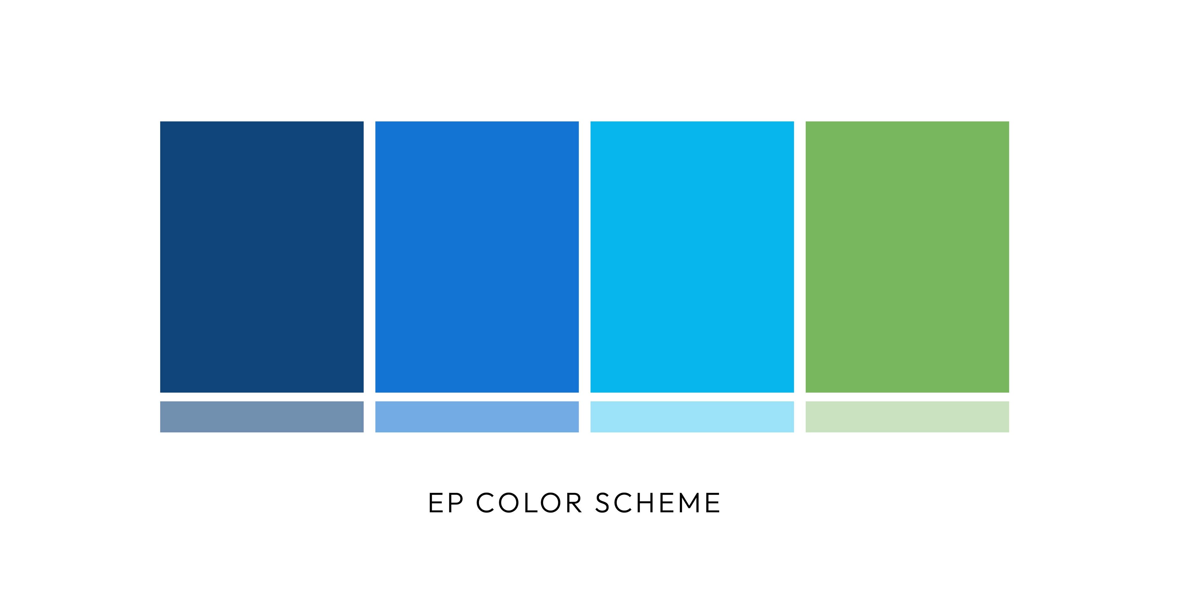
• Pride at EP is a logo in the diversity series with a unique design direction.
• The goal was to incorporate Entertainment Partners’ (EP) brand colors into the iconic Pride logo.
• The directive came from both the corporate team and the Pride board members.
Design Process:
• Integrated EP’s brand colors into the logo design.
• Maintained the essence and symbolism of Pride while reflecting EP’s brand identity.
• Ensured the logo clearly represented Pride, even without the traditional Pride colors.
• Created a unified, meaningful design that honors both Pride and EP’s brand.
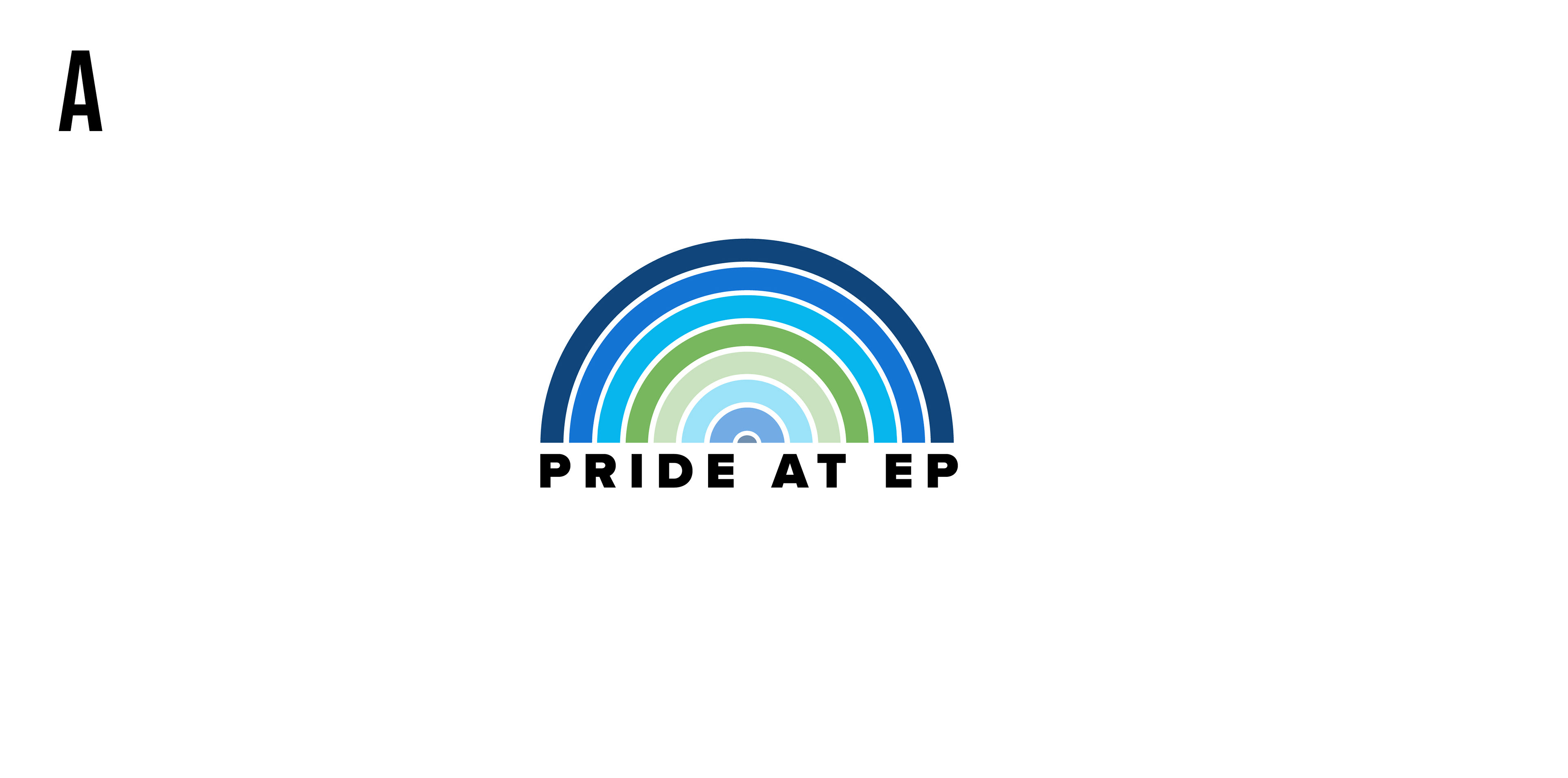
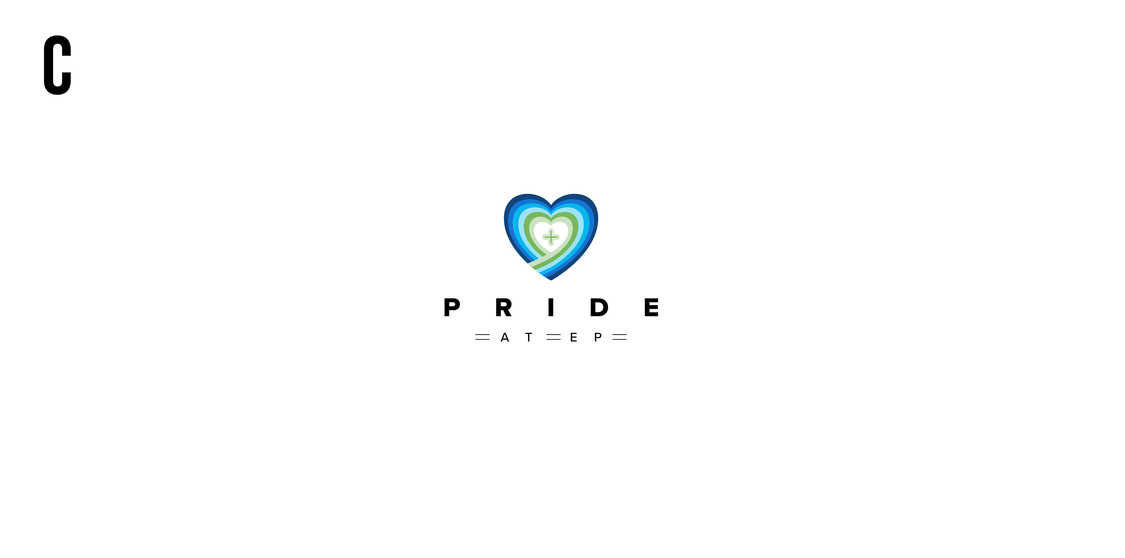
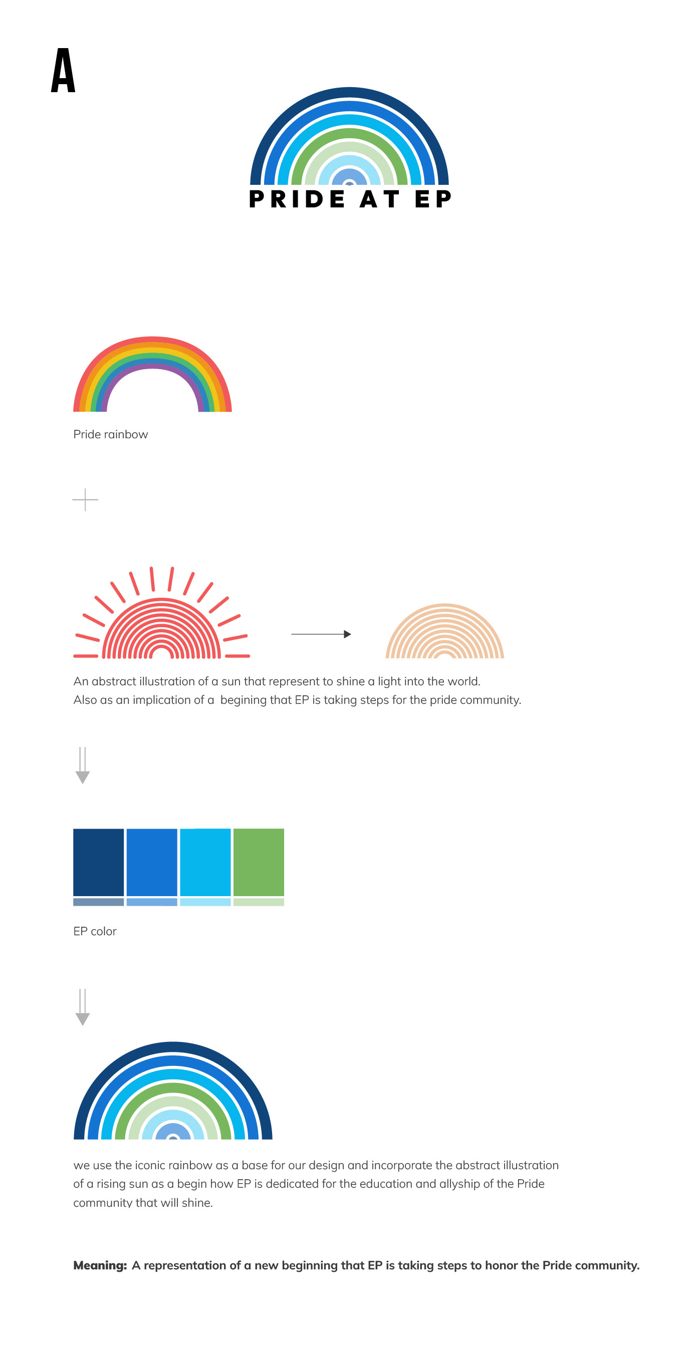
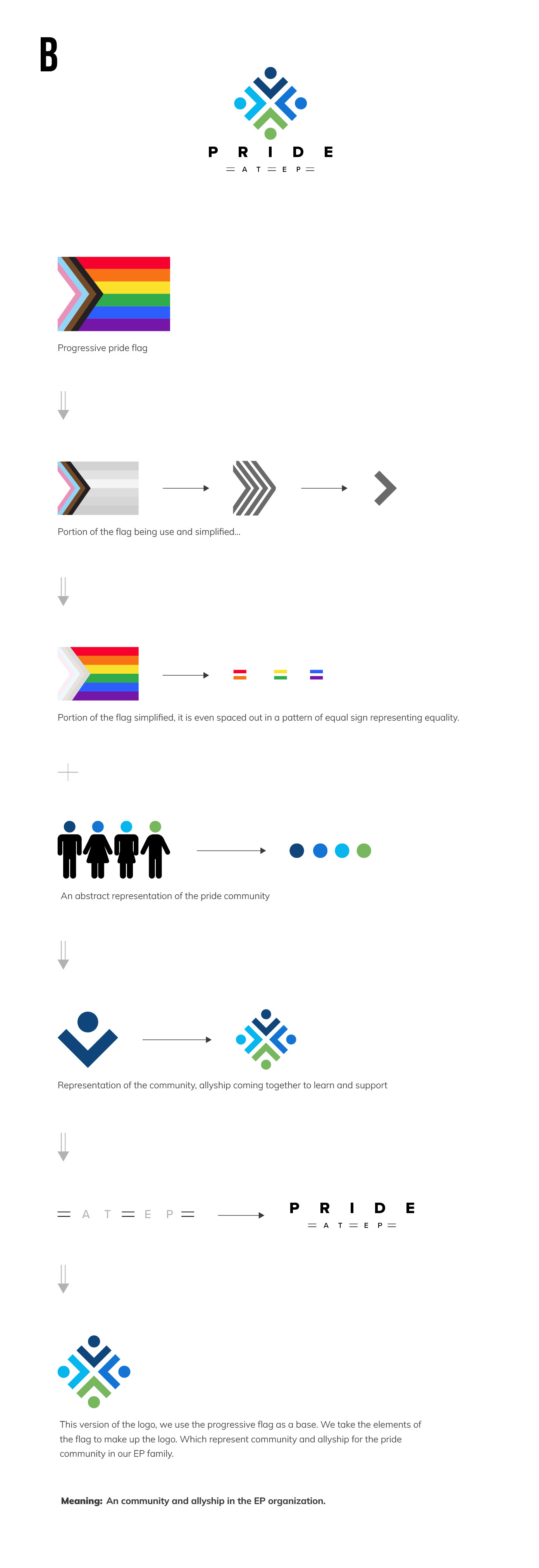
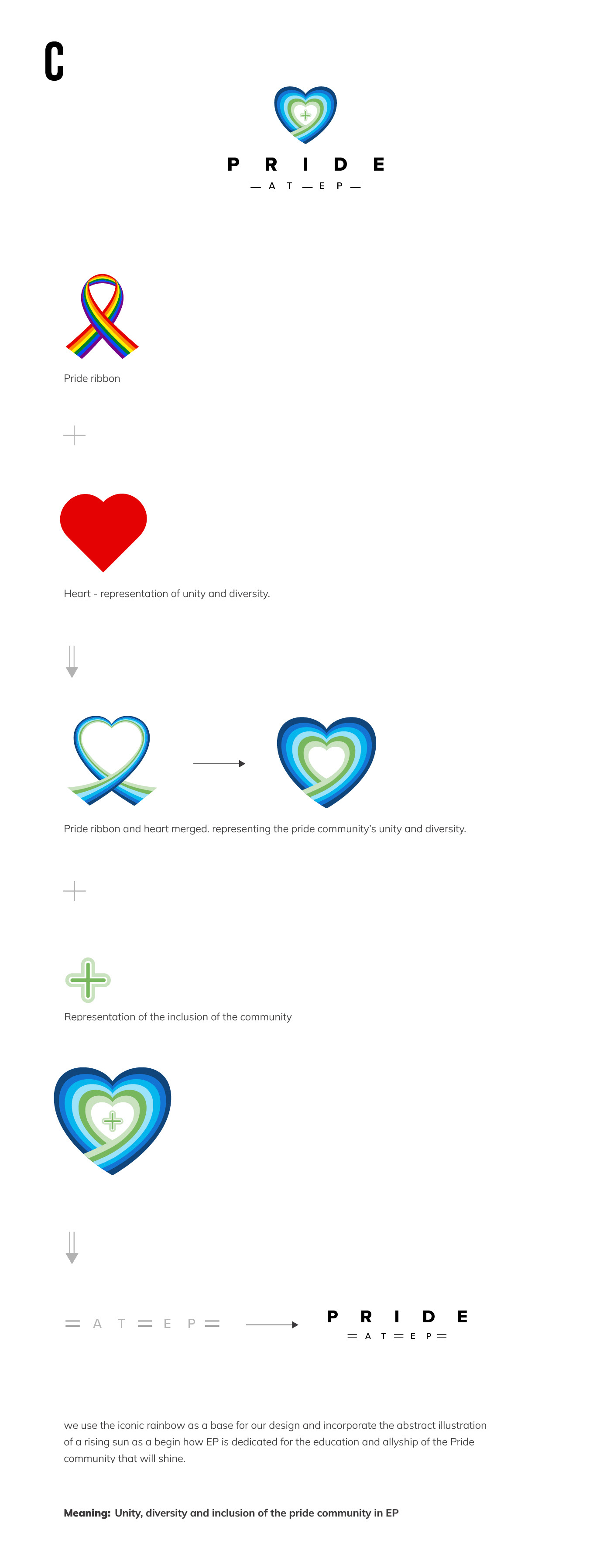
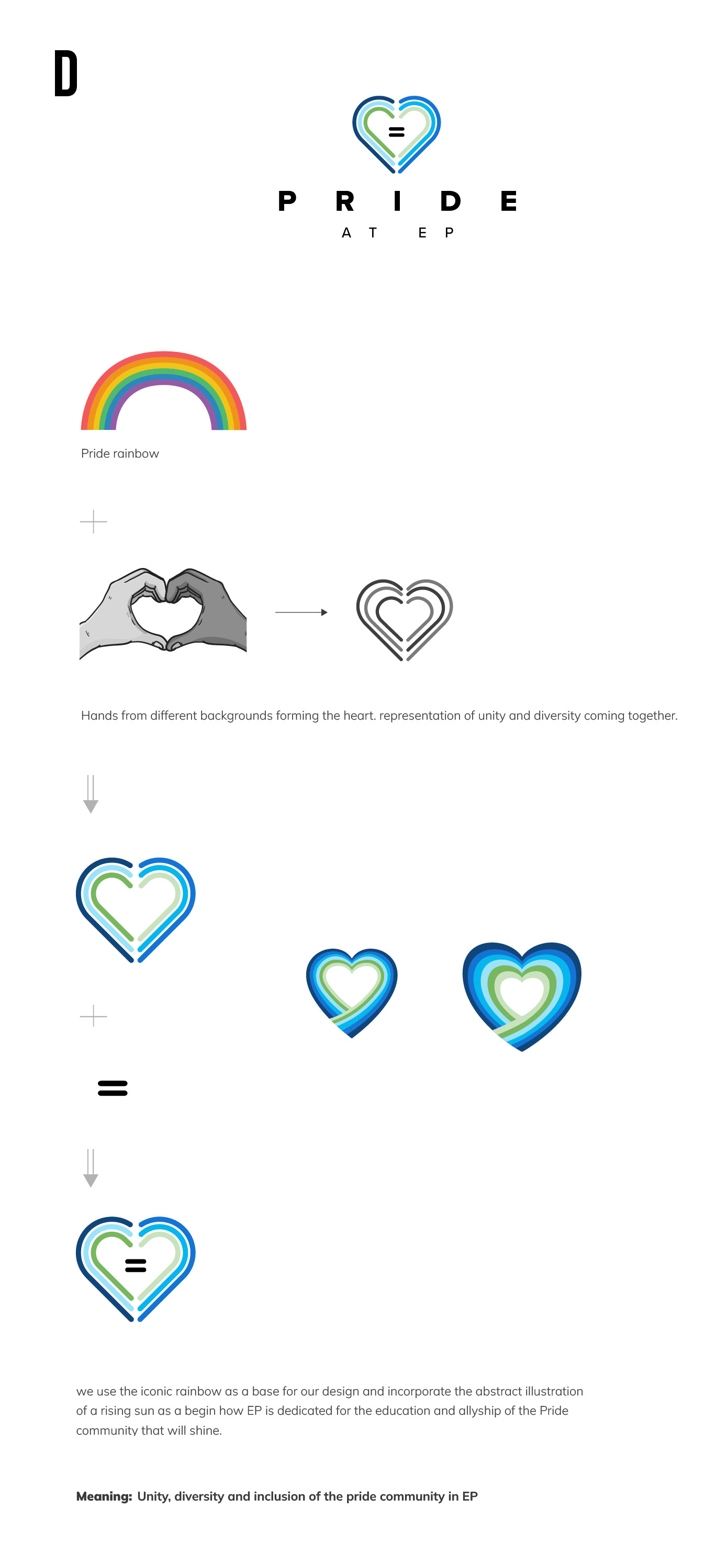
Logo Options

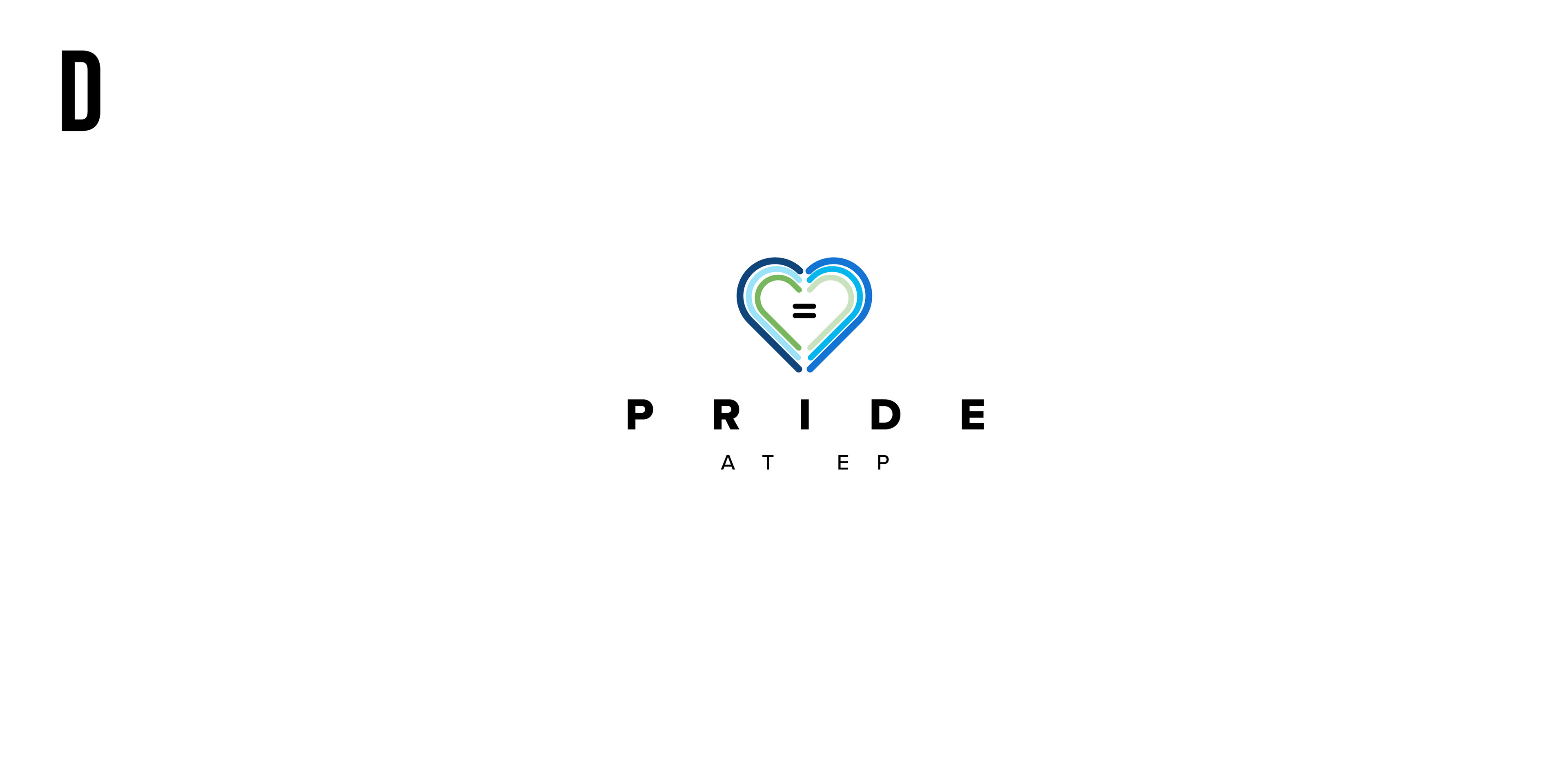
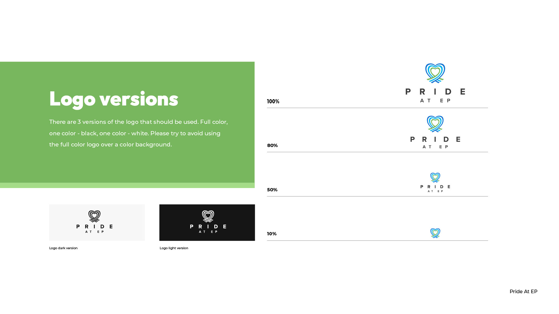
Logo Selection and Style Guide Development
After presenting the logo concepts to the board members, one design was selected to represent Pride at EP. Following the some minor changes, I developed a comprehensive style guide to ensure the logo’s consistent and effective application across various platforms and materials.
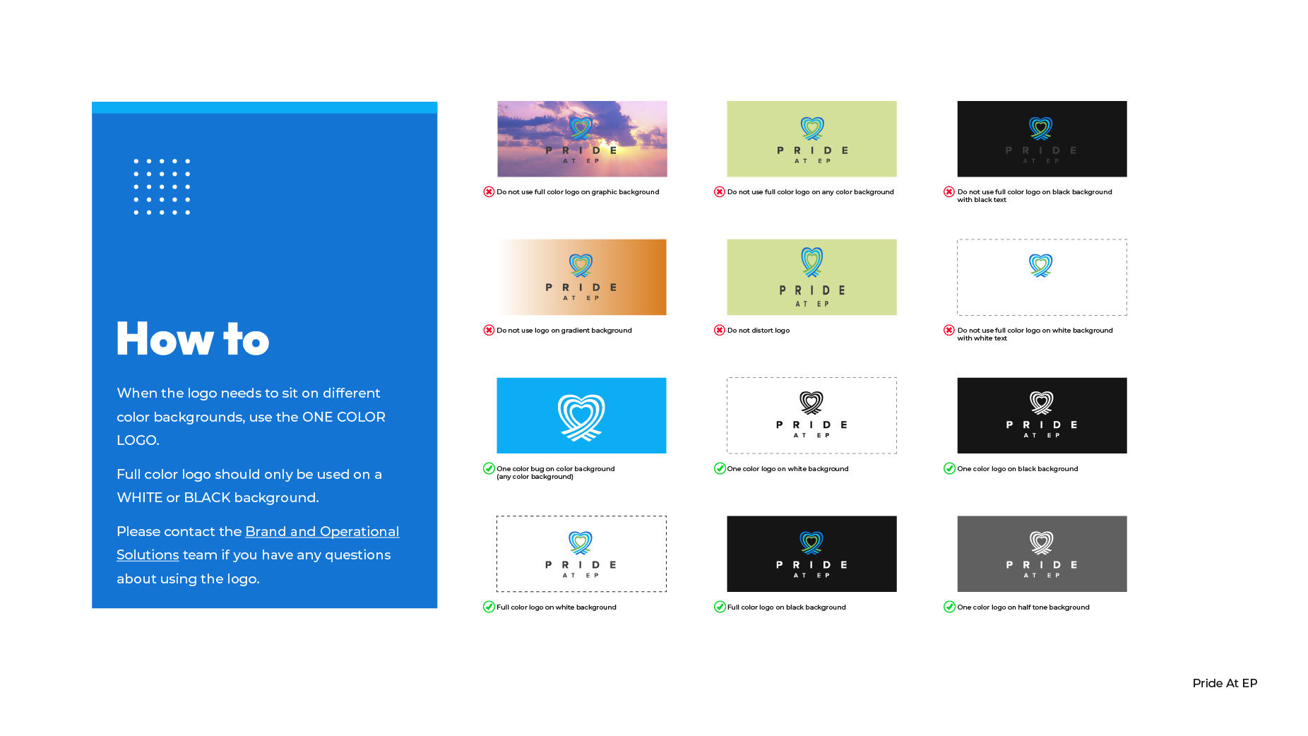
Deliverables:
• Black-and-white logo variations
• Full-color logo variations
• Detailed guidelines for usage in campaigns and communications
This process established a cohesive and professional visual identity for the Pride at EP and EP, aligning with their mission and effectively supporting their initiatives.